STARK CONCEPT
A studio from Manila, built to stand shoulder to shoulder with the best design studios in the world.
Our mission is simple: prove a studio from the Philippines can win on the world stage. Every project we ship is judged against one standard, the best studios anywhere.
WHO WE ARE
Stark Concept is a web design and development studio built exclusively in Framer, backed by custom code and backend automation. We serve SaaS, real estate, architecture, and e-commerce brands in tier-one markets. We do not sell pretty websites. We build high-yielding business assets, engineered to make money through conversion-focused UX and save money through backend automation.
WHAT WE POST
Work Showcases
Real client builds, shown clean and unhurried.
Design Education
The thinking behind good conversion-focused design.
Results and Value
What our work makes or saves clients.
Behind the Scenes
How a Stark Concept project actually gets built.
Brand Philosophy
Why we exist and what premium means to us.
WHERE WE SHOW UP
Instagram and Threads
Value-first content for founders and business owners. This is where we prove we are worth hiring.
Website showcase reels • “Free build” series for a creator’s business • Carousels breaking down design or conversion principles • More formats to be researched and added by Bea over time
Sample Videos by Pillar
Work Showcases
Work Showcases
Work Showcases
Work Showcases
Work Showcases
Work Showcases
Work Showcases
Work Showcases
Design Education
TALK TO POTENTIAL CLIENTS, NOT OTHER DESIGNERS
give and give and give and give them values and expect nothing in return.
Design Education
Design Education
Design Education
Design Education
Design Education
Design Education
Design Education
Design Education
Create a series post
Design Education
Design Education
Design Education
Design Education
Design Education
Carousel
Design Education
Design Education
Written, case-study-led content for decision makers. Text-first, not video-first.
Case studies with the business result • Founder point-of-view on why websites lose money • Short process or build breakdowns • Company milestones and team growth updates
X & Contra
A designer’s community. Work and craft, not sales pitches.
Raw work-in-progress and finished builds • Framer techniques and design breakdowns • Short commentary on design trends
Design Education
Design Education
Design Education
Design Education
Reminder: always keep a blog post active on the Stark Concept website alongside social content.
HOW WE SOUND
We are direct, confident, and calm. We never sound desperate and we never oversell. No exclamation marks. No hype language. No em dashes, ever. We are the studio our clients need, not the studio asking for work.
Do
State facts plainly. Lead with client benefit. Sound certain.
Don’t
Use exclamation marks. Chase urgency. Sound eager or desperate.
Logo

Clear space: keep the logo surrounded by generous empty space. Maintain a readable minimum size. Never stretch, recolor, or distort the lockup.
Typography
INTER
Experiment As You Go
Caption 12px
Color
#050507 #13141C #FFFFFF #94A3B8 #FF6B00
Orange is an accent, not a base. Use it sparingly, roughly 5% of any composition.
Text Spacing
-4%
Content creators inspirations | Vibe
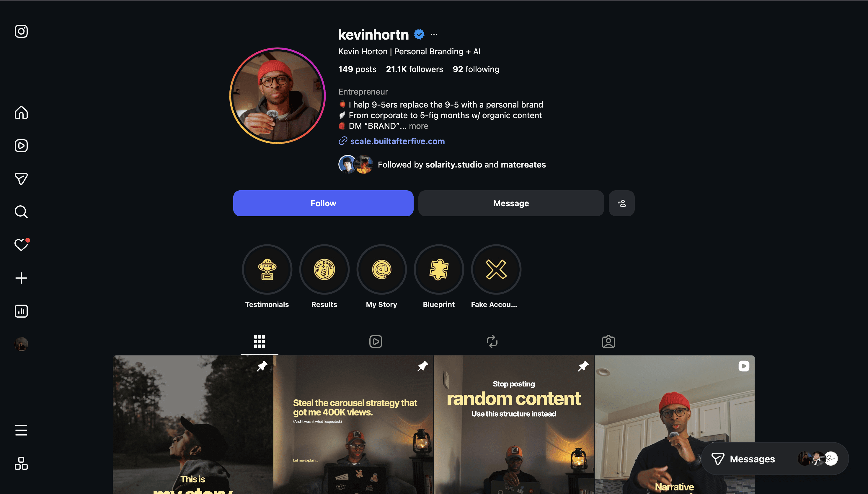


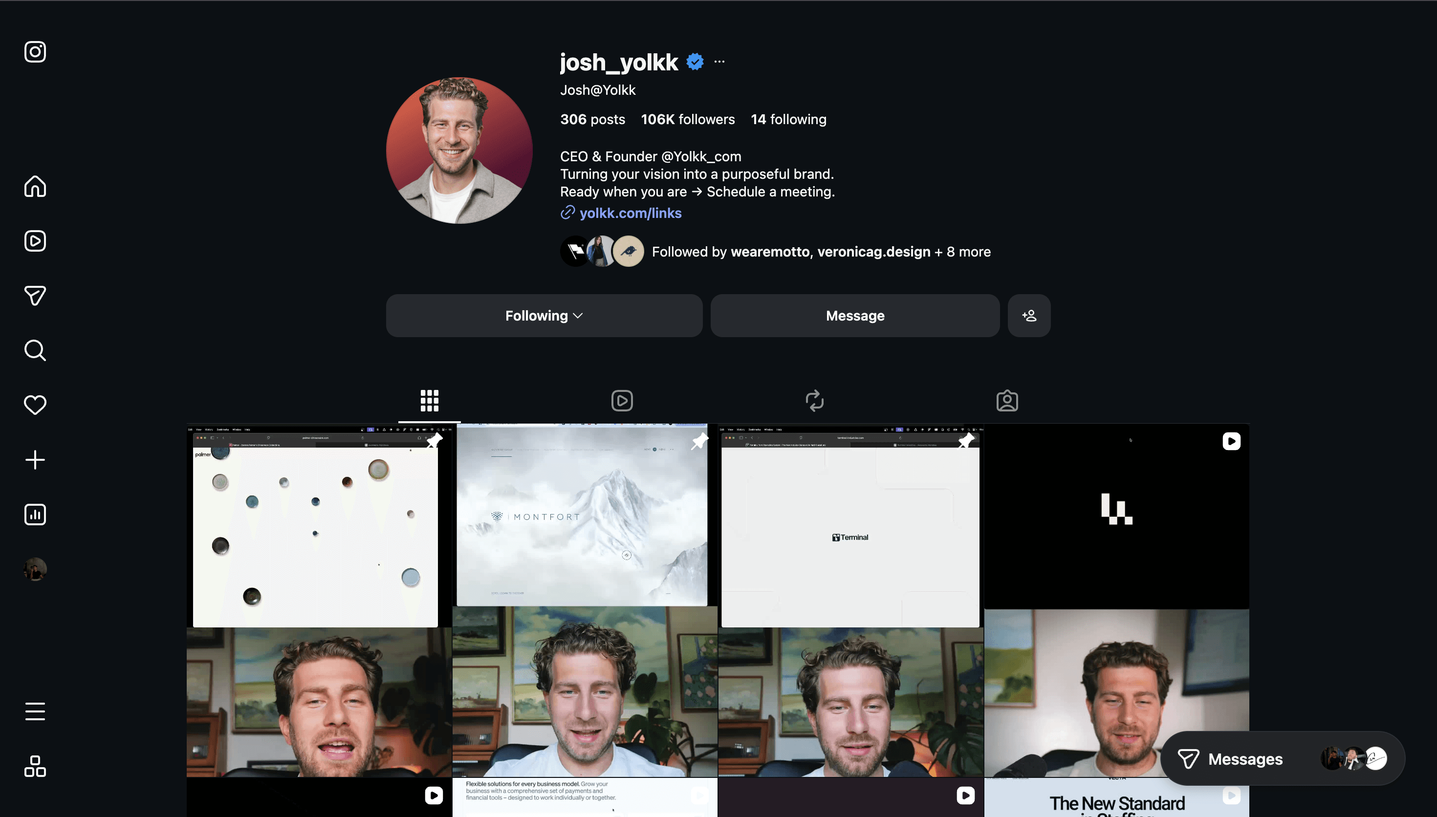


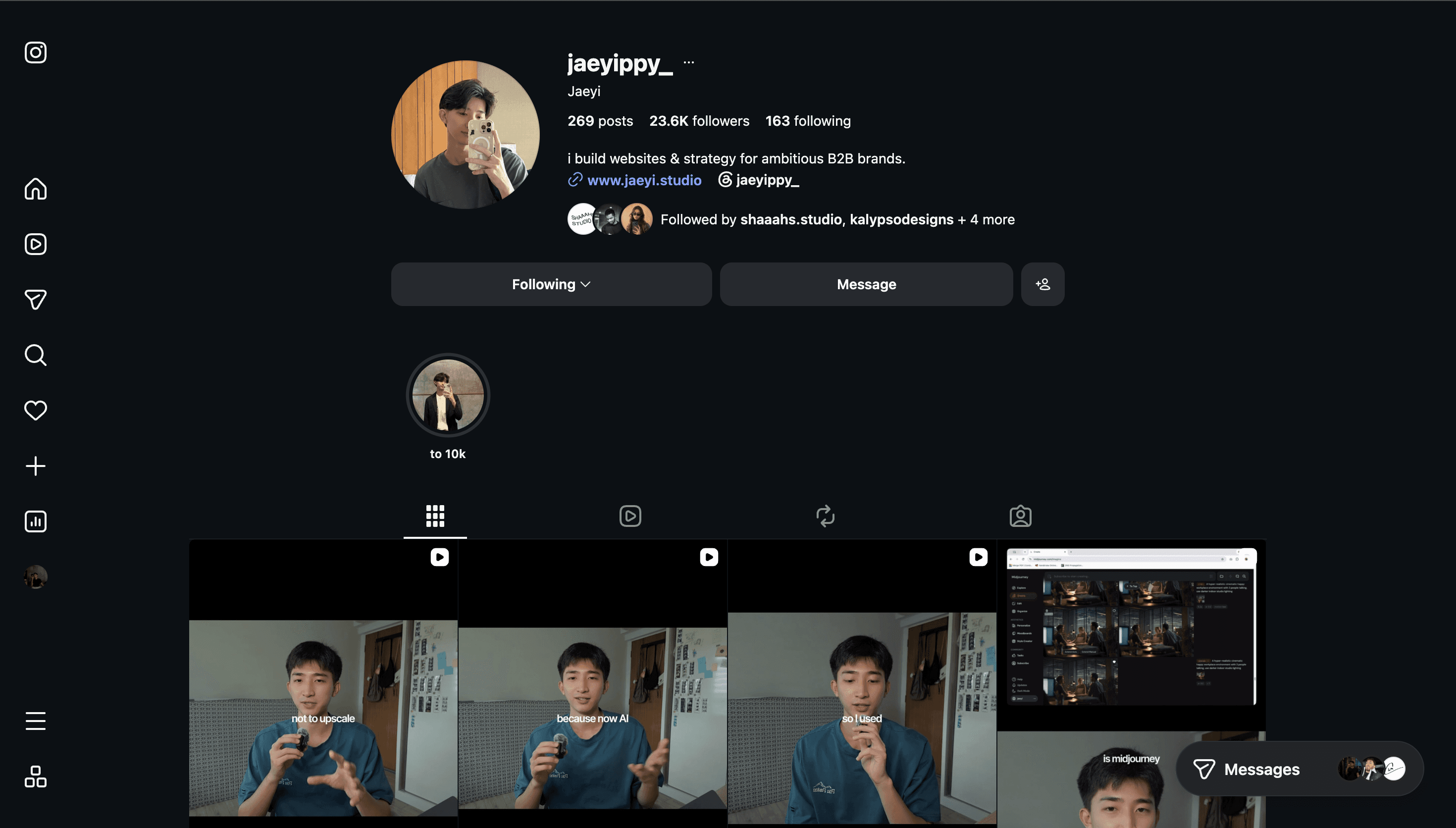
Clean, high-contrast, real product and real work. No generic stock photography.
HOW WE FILM
All video content is smooth 60fps recordings of real Framer builds, shot with intentional pacing. We never use hyperactive edits, flashing kinetic text, chaotic transitions, generic stock footage, or trending meme audio.
QUICK REFERENCE
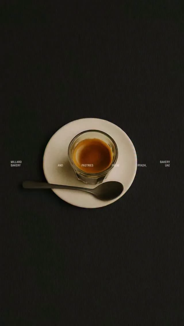
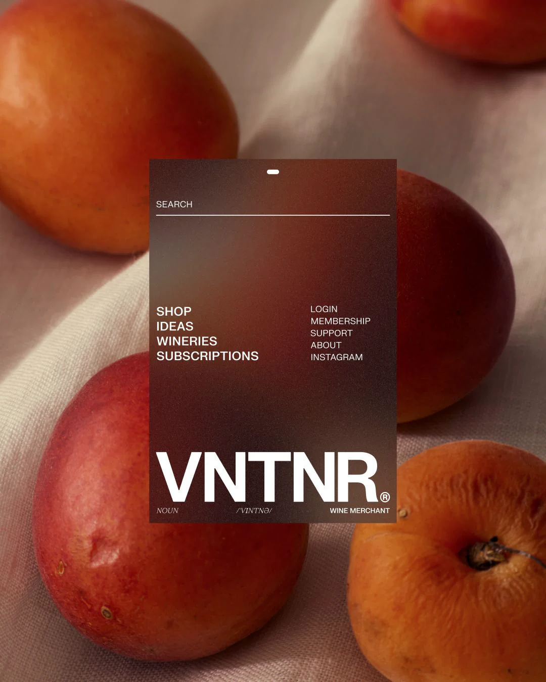
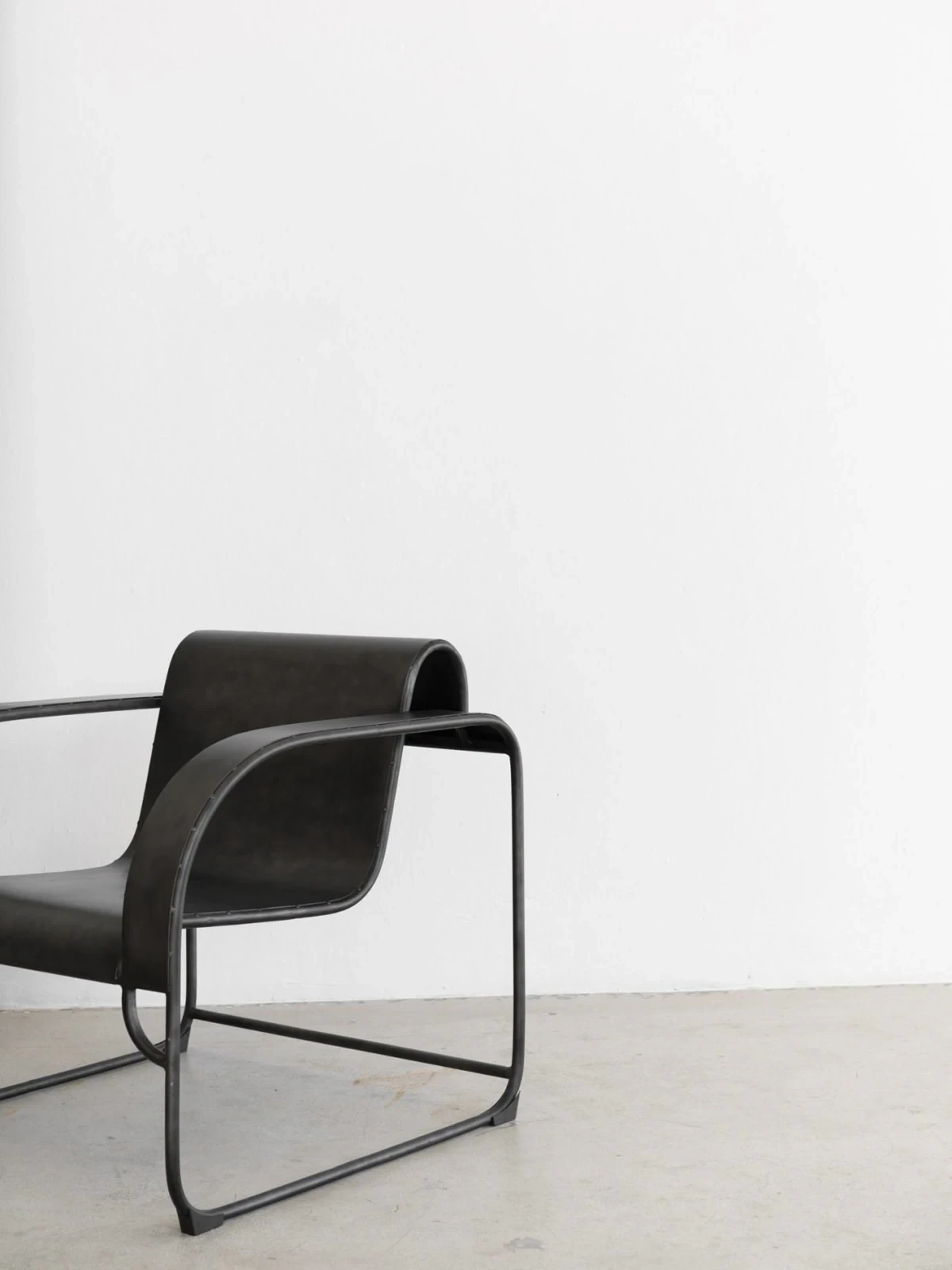
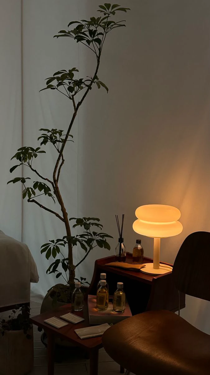
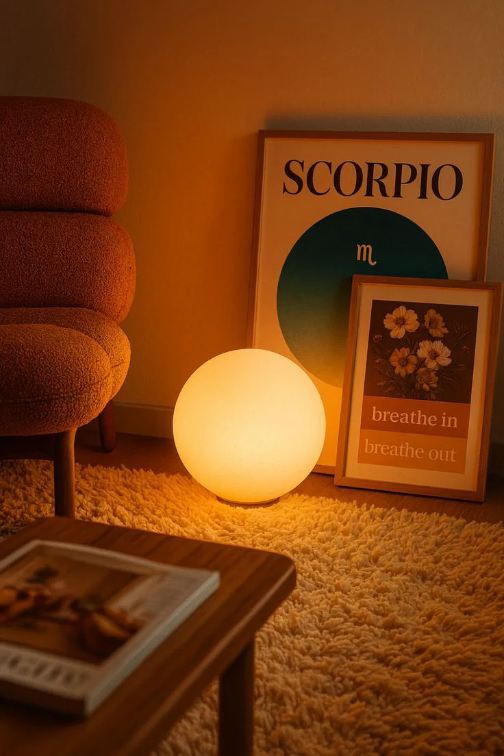
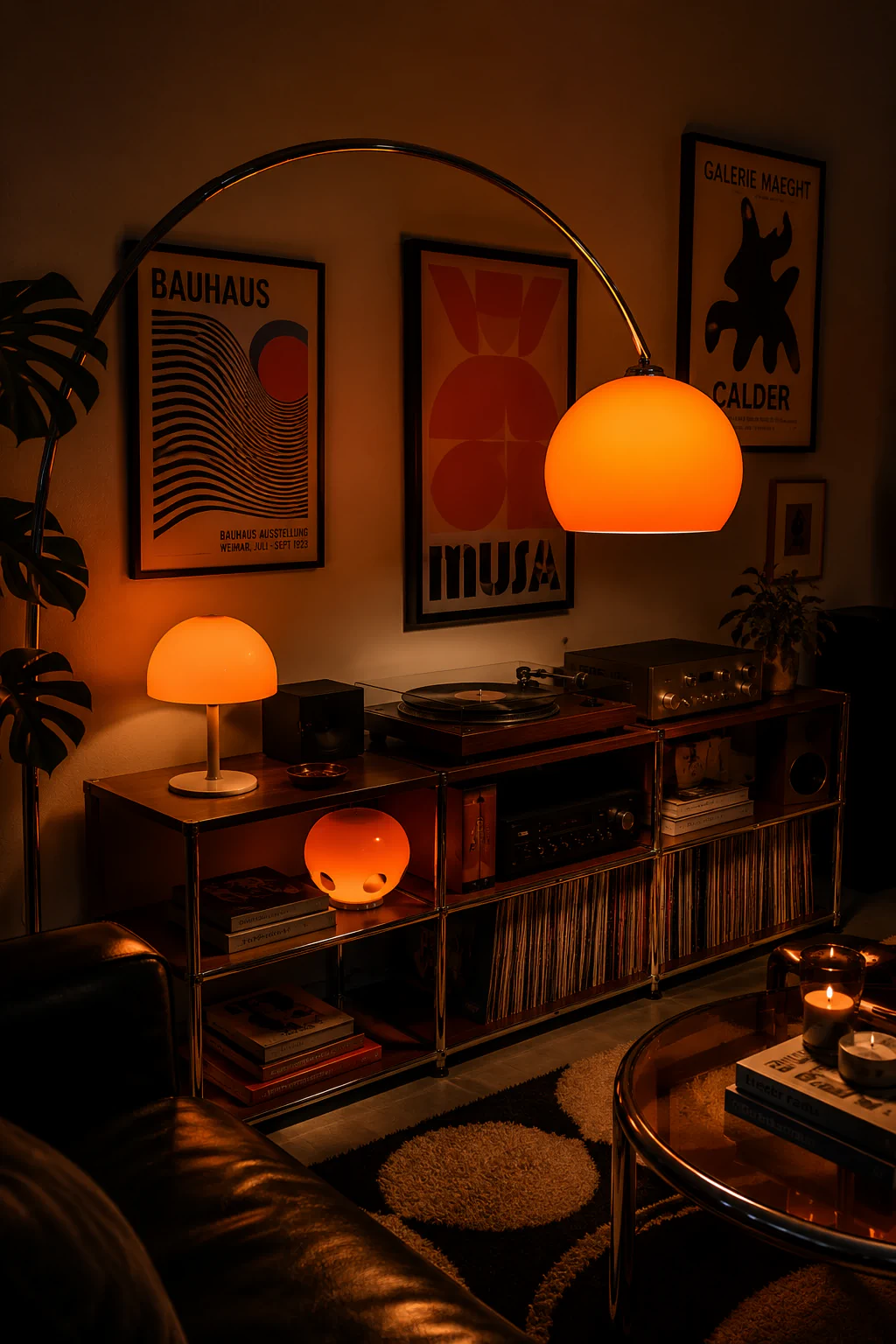
Visual Moodboard
Dark, cinematic product shots of real Framer builds; high-contrast minimal interiors and architecture for tonal reference; and stills inspired by Radoslav Bali, Blanked Studio, and other award-winning tier-one Framer agencies.